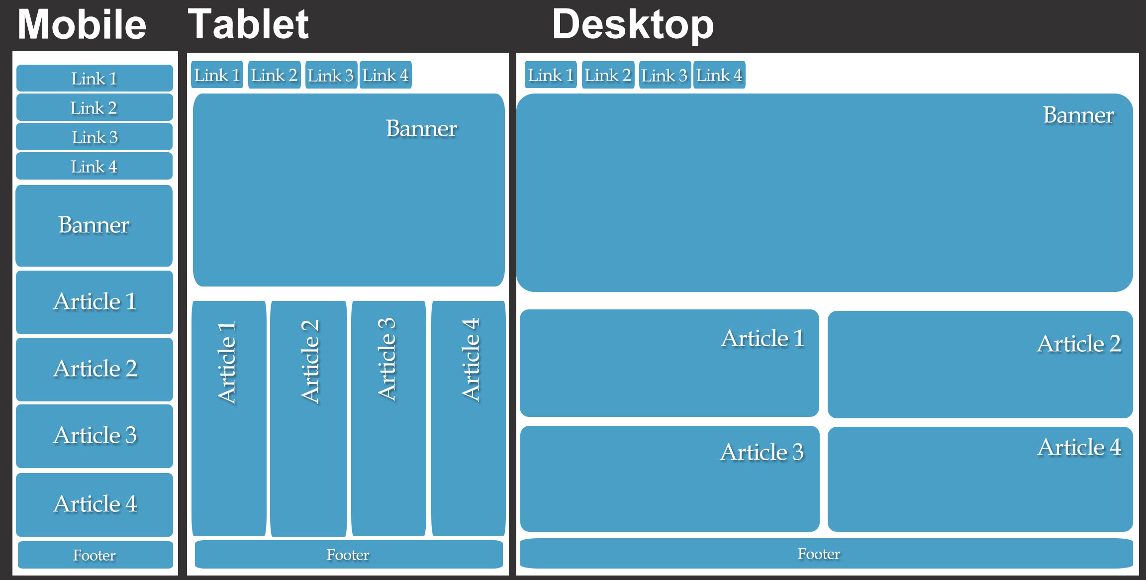
Mashable declared 2013 to be the year of responsive web design. Responsive web design is the optimization of websites on different screen sizes in order to create a greater user experience. The basic idea is to have content appear seamlessly across different screens. To accomplish this, developers and designers must ensure that:
- content loads on any screen resolution in a timely manner
- layouts and text sizes are properly scaled
- they can anticipate and respond to a users needs before they even know they need it
Responsive Design Myth Bust
Despite the fanfare of this design approach, responsive design has become plagued with some negative myths attacking the method. Knowledge is power, so read on as we dispel a couple of these falsehoods.
Myth #1: Content Usually Becomes Hidden
Designers and developers have the ability to mend any restrictions, so content is actually accessible to everyone no matter what device they are using.
Developers don’t have to hide content, because if it’s important on a smartphone, then it will be equally important on a desktop. If material gets axed, then it probably wasn’t necessary to begin with.
Myth #2: A Diverse Experience Is Ideal
What users really want is a unified experience. Whether someone is using an Apple iPhone, Google Android tablet, or Windows Desktop, the material should still be presented the same way. Responsive design unifies content across multiple devices and creates a sense of cohesion since developers do not have to create different pages for each device.
Myth #3: The User Isn’t Put First
Web developers who use this method always put the users first. Designers know that content must still be viewable on smaller, less powerful devices. Responsive design helps to not sacrifice performance.

Myth #5: Websites Load Slower
Designers create sites from a mobile-first perspective. So, special consideration is taken for people with low bandwidth. Also, developers make sure no hidden content on screens is being downloaded to cause long load times.
Myth #6: Time Costly
With responsive web design, developers only have to maintain one website. It’s a lot simpler to manage the page layouts of new devices than it is to build and manage separate websites that are optimized for different devices.
Time is saved since the fluid grid shrinks to match the dimensions of most screens whether big or small.
Myth #7: Bad For Business
Businesses who are only designing their website for certain devices could possibly be closing off their product from potential customers. You would never want to alienate your base because of false assumptions about what device your market is using. Responsive design creates opportunities for a superior user experience on all devices.