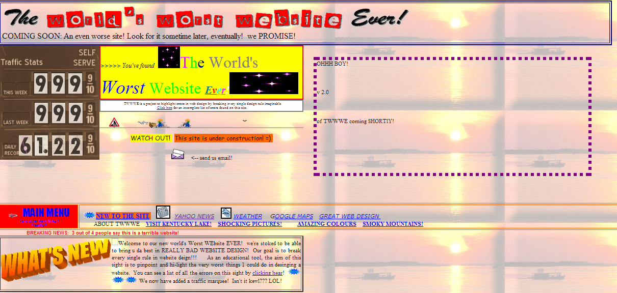
If there is one thing I truly hate about my job (and it’s literally the ONLY thing), it’s the hyper awareness I have gained about web design since I started working here. It’s actually a curse to Google anything and realize that things that would previously have gone unnoticed suddenly annoy me with the intensity of an OCD person trapped on an episode of Hoarders. Here are just a few of the many, many mistakes I see on websites that make me cringe.
Lack of Mobile Optimization
As a Millennial, I’m the first to admit that about 99% of my searches come from my phone. I may be an outlier even for those in my age group, but the fact is- mobile searches are on the rise. This is not to say that mobile optimization is essential for EVERY website, but it is becoming more important every day especially for those marketing to younger generations.
“Busy” Web Design
Websites that have too much going on, such as too many colors, tabs, words, images, videos or ads, are visually unappealing and create terrible user experience. They look cheap, spam-y and leave the viewer feeling overwhelmed. A simple design where information is easy to find and there is only one clear call to action on each page is always preferable.
Bad Fonts
This encompasses fonts that are too small, hard-to-read serif fonts on long copy, poor color choices on fonts or backgrounds, and even fonts that convey the wrong tone for the website. Many of these simple mistakes could be avoided by following some basic rules of typography, yet these issues are still prevalent on many websites.
Long Load Times
Ten or fifteen seconds may not seem like much, but when that time is spent waiting for a page to load, it can feel like an eternity in a society and an age where people want everything to be instant. The most common culprits of slow loading times are too many page elements such as images, video, and JavaScript; under-powered or shared servers; or improperly formatted images.
Music or Sounds
Aside from being another added element that decreases loading time, music (especially when it can’t be muted) such as jingles or videos that start automatically can be startling and just generally annoying to the website visitor.
These are just some of the things that I’ve come across that can literally scare me away from a website. Comment below to add web design mistakes that horrify you!

