
We’ve all heard the stories; electric shock from third party smartphone chargers, busted lips from laying in bed and holding smartphones inches above the face, and AT&T’s “It Can Wait” Campaign. It’s simple; users refuse to cut the smartphone umbilical cord, which has allowed them to experience the good, the bad, and the ugly of obsession. Despite these headliners, many businesses have used the attachment to their advantage by optimizing their websites for different sized screens. This approach, known as Responsive Web Design, was once considered a trend however; our fast-paced lives and technology dependent mindsets have aided its evolvement into the future of Internet browsing and web design.
Crawlin’, Walkin’, Runnin’
Any smartphone owner can record their daily routine and see how much they use their mobile device.
-We began our cellular journey by relying on phones to make and receive calls.
-Modern SMS messaging between mobile devices was introduced in 1994 and absolutely changed communication around the world.
-In 2007, the first multi-touch smartphone was released by Apple, in which Steve Jobs announced, “The phone was not just a communication tool but a way of life.”
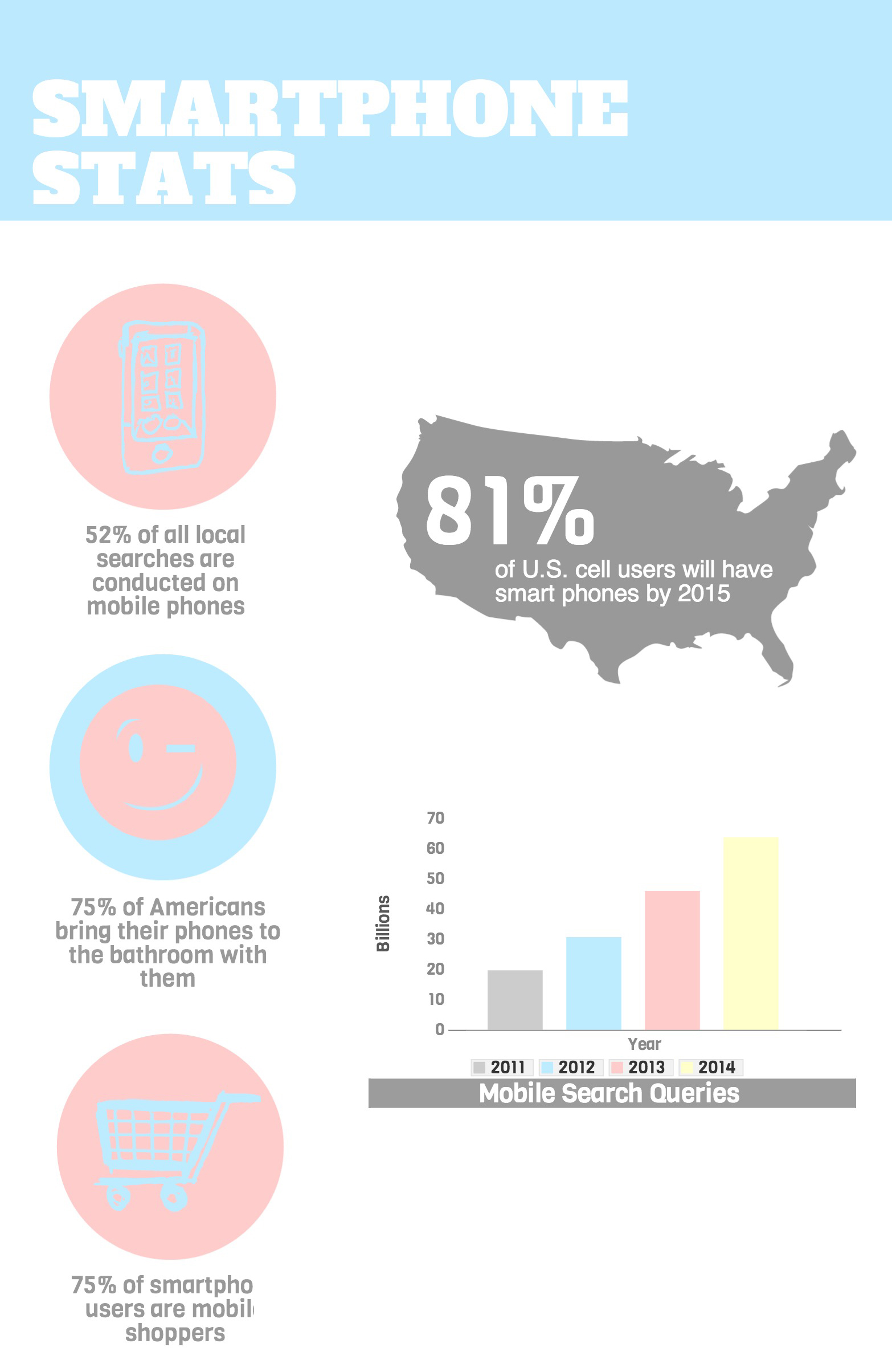
-As of January 2013, there are 129.4 million mini-computers in U.S. hands.
Obsession Brought Opportunity
Applications such as Yelp, Urbanspoon, and Google Maps have led to on-the-go queries for businesses of all sorts. When a user visits a website on their cellphone, a couple, magical things are bound to happen:
- The company’s mobile site is launched
- The responsive website is launched and adapts to the device’s screen size
The vast amount of mobile search queries has skyrocketed in recent years, creating a unique opportunity for businesses to ensure they have a responsive website that can be seamlessly navigated on screens of all shapes and sizes. This safeguards design and content consistency, despite the user’s device preference and also provides a sense of comfort and security knowing that the website will never drastically change and “surprise” a consumer.
As of July 2013, 55% of businesses have a mobile optimized site, which generates surfing ease for the 84% of smartphone users who browse the web on their phone.
Smoother Than a Baby’s Bottom
The ease and seamless navigation through responsive websites sheds a calming light upon browsers. When a person is not in the comfort of their own home with their desktop computers, they prefer and rely on straightforward information provided by their tablets and phones. The benefits of developing and maintaining a responsive website all go hand-in-hand:
1. Accessibility
The ability to access a single website across different devices ensures potential customers are satisfied to view your content the way they want to and not the way they have to. Sometimes, mobile websites leave out chunks of information as a means of maintaining a condensed, app-like site. The freedom to access a business page anywhere and still obtain necessary information puts browsing power back into the user’s fingers, and does not constrict them to obligatory searches through vague mobile sites.

2. Bounce Rate
Any business owner’s nightmare. Paying attention to the details when creating a RWS can help attract and keep web browsers on your page. Ensuring that images are scaled properly for a smaller screen can avoid bandwidth issues. Smartphone owners are fast-paced humans; waiting 5 seconds for a page to load is borderline absurd and usually results in a person “bouncing” from the slow-loading site. An independent study was conducted in my office which included my Real Housewives’ obsessed colleague (cough, Judy, cough) waving an eternal-loading mobile site in my face. Afterwards, I found that four mobile sites took an average of 9 seconds took fully load whereas, four responsive websites took an average of 5.25 seconds. Keep in mind that most customers will “bounce” if they have to wait 7-10 seconds. Tests were done on two iPhone 4S models, one on AT&T’s 4G network and the other on Verizon Wireless’ 3G network.
4. “Content is King”
Quality will always reign over quantity. Maintaining a single website that is optimized for different sized devices allows businesses and writers to focus on producing rich content and maintaining high SEO ranks rather than developing different copy for a mobile site and their full site.
5. User Experience
At the end of the day, it’s all about the consumer, right? They can be sitting at home on their laptop or halfway through a road trip from Texas to California. Despite the device size, both web surfers are capable of sharing a synonymous, pleasure filled experience when browsing the same site. Welcome them with open arms and warmly part ways to confirm their return.