
E-commerce or electronic commerce has made online purchasing a dream for avid shoppers. Users enjoy the ease of viewing products, learning about promotions, and buying their favorite items with just a few clicks. It’s an online shopping love story for businesses and customers- that is, until it’s time to check out.

Shopping Cart Heartbreak
Just when the world felt that it couldn’t get any better than shopping from home in your pajamas, recent findings revealed otherwise. While shoppers seem to have committed to a long-term relationship with their shopping carts, many hit the floor running when forced to face site checkouts that are less than user-friendly. According to Smashing Magazine, approximately 65.95% of online shoppers ditch their shopping cart before checkout.
What happened, e-commerce? Smashing Magazine conducted a study in 2011 to determine what exactly was causing shoppers to leave their carts hanging. The research indicated that many businesses which utilize e-commerce fail in the following areas regarding user experience when it’s time to complete an order:
- usability: checkout design, layout, and practicality
- security: user-trust and assurance
- clarity: preciseness, simplicity and appropriateness
The Simple Solution
Data illustrates that online checkout processes depend greatly on functionality. Don’t make shopping complicated. Confusion related to poor word choice, and hard-to-follow steps may be enough to have shoppers ready to abandon the whole purchasing process. The following tips can promote a more seamless experience for your customers:
Having steps within steps confuses and intimidates customers as it breaks with their mental model of a linear checkout. Christian Holst with Smashing Magazine
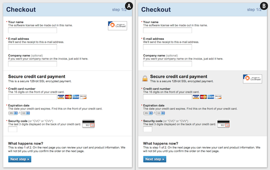
A. Design checkouts in a linear fashion and in a way that users are familiar with. The steps to purchase the items should be logical and simple. While the amount of steps may vary, businesses should focus more on the requirements of each step. Also, research indicates that pages with more than one column may confuse browsers, or information may be overlooked. Try to implement a one-column page to increase usability.
Format fields in a way that will match what shoppers are accustomed to. Credit card and debit card information should be presented as seen on the card so that users can easily input information. For example, the expiration date should be listed in numbers (i.e. 6/13) rather than in words (i.e. June 2013). Tailor fields to this information.
B. Avoid words that may be misleading. Certain words may imply several different meanings. Be clear when using “Continue” or “Go”. Where will these buttons take users? If a shopper is taken somewhere else than expected, they may become frustrated.
C. Prevent hassling with errors. Have an auto-fill option. Filling out information more than once can lead to a higher chance for errors and just plain annoyance. The majority of shoppers have the same billing address and shipping address. Skip the hassle and opt for an auto-fill setting. Furthermore, error notifications should indicate exactly what is wrong with the page. Shoppers who continue to make errors and receive error notifications are likely to be discouraged from completing the transaction.
Privacy R-E-S-P-E-C-T
Respect shoppers privacy. Require account registration and newsletter sign-up appropriately. People often view log-ins as a nuisance. For many it means having to remember more usernames and passwords, and opening doors for spam and annoying emails to be sent to them. However, most shoppers like being able to check boxes or sign up for newsletters at the end of the checkout process. Give customers an option!
Business-Shopper Trust Issues
You wouldn’t give your credit card information to just anyone. Online shoppers usually won’t either! Customers value the feeling of security and safety when shopping online. It is important for businesses to guarantee that customers’ information will be secure, even if this means just making it look more secure. It’s all about perception! Small icons or visual elements can encourage shoppers to feel that the site is reputable and safe (see below).
Easy E-Commerce
Although businesses can’t always keep shoppers from breaking up with their shopping carts, implementing these features will reduce the possibility of a shopper leaving for unnecessary frustrations. Don’t lose customers over a poorly designed shopping process. Instead, be sure to enhance the overall shopping experience; both you and your customers will be glad you did!
Sources: